Float
(Floaters:
6 )
Description:
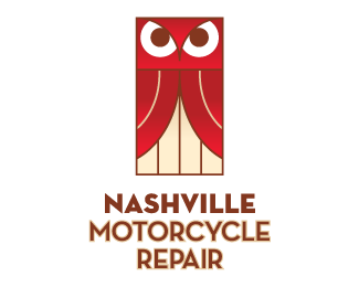
Logo for a small motorcycle repair shop that is friendly to all kinds of riders.
Status:
Client work
Viewed:
1743
Share:


Lets Discuss
why an owl? I like the type on it's own.
ReplyThanks! I like the type, too. The owl icon is for %22wise repair.%22 Not just any kind of repair, but the smartest repair possible.
Replywell designed but absolutely off target/market.
Replywell my first thought was it is a theatre logo...can't see the relevance either.
ReplyI agree with the above comments. Perhaps you could make the eyes look like wheels or headlights?
ReplyI thought it was for a Theatre-Piano Bar.
ReplyIt initially had one wing covering the body, and there's a version with both wings spread out, but this is the version the client liked so that's what it is. I agree that it does resemble a red curtain.**As for being off target, the client wants to target all riders, including women, and not just the Harley types. If that were what he were going after it would dramatically different.**Thanks for your comments!
Replybut still...an owl? did the client want an owl?
ReplyAnd even if the client DID want an owl, it should still relate to bikes/repair somehow. Have the owl perched on a bike wrench or something. or the eyes made of lug nuts, etc. If you were to look at the current mark without the type, would you connect that it is for a bike repair shop? Then when you see it WITH the type, it just gets really confusing.
ReplyPlease login/signup to make a comment, registration is easy