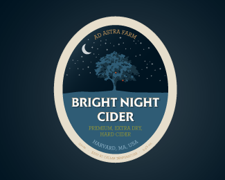
Description:
Cider label & logo
Status:
Client work
Viewed:
9934
Tags:
label
•
apples
•
tree
•
cider
Share:
Lets Discuss
Like the color..!
ReplyGreat illustration!
ReplyMay I just ask you what's the label and what's the logo here?
Reply%5E Good call.
ReplyWow. Nice.
ReplyWow, amazing.. great work :)
Replyvery!! nice work
Replyso much depth... i feel like i'm looking into a window.
ReplyWhy should a logo be so defined? I think this is beautiful. Sure it's breaking some rules, but this is brilliant no matter.
ReplyHere, I don't think there's any need to technically distinguish between the what is the logo or label. On logopond, everything is outside of it's intended context. Usually it's a logo, but sometimes it's a T-shirt design (done that) or something else. Here it's very nice.
Reply@Type08 It's both why ask?
ReplyWithout going into the logo/label thing, you have a lot of really really nice work, chuck, and i think the bigger question is how this one got chosen over some of your other pieces. **Love the illustration here. Very delicate and well done, but the type could use some help fa sho.
ReplyLovely design!*I like the way you left few red fruits still hanging on a tree, like they're telling a story about cider.
ReplyWow.. Great logo design, giving a nice feeling.. Thumbs up mate
Reply@Mike: I asked the designer of this piece, and I asked politely. He can answer %22No, you may not%22 if he wants to. Democracy, yah know %3B)
Replywow...thanks for all the comments folk...didnt expect this to be honest....but im very glad : )**a litte discussion is never a bad thing*and i get the question about label vs logo...*in this case the lines gets blurry on whats what i get that, but as often's the case when it comes to beer, ciders and even wine sometimes the actual label design IS the logotype...as a whole or in a slighty extended or truncated form.*
ReplyVery good. Great execution.
Replychuckcogan is right. as a beer drinker, I've always noticed the logo/label mixture. With domestic beers like bud light, miller light, there's typically more definition between the two, but with craft beers especially, the label and logo are often one in the same.**@chuckcogan , definitely a nice %22logel%22
ReplyThis is really, really good. I'd love to see it in action.
Replythanks folks :)
ReplyI really like that you have used a style here that instantly communicates the product. Nice illustration work too.
ReplyAd astra per aspera...
ReplyWohaa this is great.. Love the whole thing.. Gives a nice feeling, and now i want to have a cider :)
ReplyWow, nice illustration.
ReplyPlease login/signup to make a comment, registration is easy