Description:
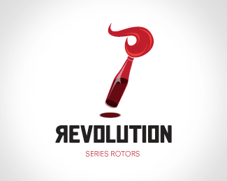
Logo for a brand of motorcycle rotors. I am looking for any feedback. So please feel free to post.
Status:
Nothing set
Viewed:
2950
Share:






Lets Discuss
A nice graphic for sure. I don't think it is right for motorcycle rotors.
ReplyI'm not sure exactly what rotos are...but from a purely visual stand point... looks good. Maybe flip the 'N' too?
Replythe mark kind of reminds me of a paint brush. maybe separate the flame from the bottle, and soften the shadow a little. i think it takes away from the mark.
Replyvery nice man!
ReplyI love the mark, but I agree that the shadow is a little dark.*Also, I don't know about it's recognisability to rotors.
ReplyPlease login/signup to make a comment, registration is easy