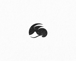
Description:
© Gert van Duinen | cresk design
As seen on:
gertvanduinen.com
Status:
Unused proposal
Viewed:
2079
Share:
Lets Discuss
Wow, nicely stylized image. I love how it works without color.
Replygreat ... stunned by this logo ... it's magic ...
ReplyTnx Bernd :P
ReplyAnd Jon :P
ReplyHa nice@
ReplyI'm glad you guys recognize the mark, as I was really unsure if anyone would ever notice :P**Thanks for the comments peops%7E!
ReplyYeah, I immediately saw the island and the wave. However, as a designer, I'm trained to see negative space as clearly as positive space. Yet some people, no matter how hard they try, just cannot see negative space, so, unfortunately, there may be some who have no idea what this shape is. Just something to think about if you intend on using it for a client.
ReplyVery true. Guess it's impossible to serve each and every person on this earth.. Negative space can be a good thing and I have my share of creating some, though it shouldn't be a main objective, just an added bonus.
ReplyReally, really nice. Great use of negative space.
ReplyAt a smaller size, it sort of looks like sonic the hedgehog, imo. but up close, a great composition comes to life.
ReplyInteresting perception Nash. Always nice to see what people come up with. I think the branches of the palm tree kind reminds of sonic the hedgehog's head indeed :)
ReplyPlease login/signup to make a comment, registration is easy