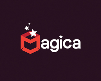
Description:
Magica , slfmde typo
As seen on:
Magica
Status:
Nothing set
Viewed:
10684
Share:





Lets Discuss
GREAT!
ReplyThe M is not defined enough. I read it as agica. This would still work with a M in the same typeface. Nice work on the icon.
Reply@bartodell: yeah , I assuming that it would be better if i will extend spaces under M letter. thanks
ReplyI agree with Bartodell about the M not easy to see straight away. Nice concept
ReplyLooks nice. I think you could try and loose the star on the i and replace it with a dot or just leave it without.*
ReplyThe M is really hard for me to find w/o knowing the company name already.
ReplyI read it as agica, too, but I like it at all.
ReplyI can't get over the fact that the 'M' is not very apparent. Have you thought about making just the 'M' part of the icon white like the rest of the letters? You wouldn't need the slits then at the bottom. Overall, this looks very nice. Just need to work a little bit on the legibility factor.
ReplyWhat they said about the M. Looking good.
ReplyLooks good!
ReplyKwaku,*Have you tried anything other than the stars? What about a rabbit to replace the stars? I agree about the %22M%22. If you made the %22M%22 white and left the box walls red and connected the bottom bar or just straightened out the ends into the proper perspective I think that might make it pop out. JMO. Great mark though.
ReplyMake the M a lighter shade of red and see how that looks. Excellent logo though!
ReplyI really like all your work. You are fantastic with colour. The colours are always spot on.
Replygmail...
ReplyPlease login/signup to make a comment, registration is easy