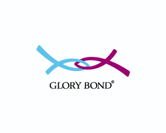
Description:
logo for a young religious group.
As seen on:
damiand.com
Status:
Client work
Viewed:
5490
Share:

Lets Discuss
I like that the standard %22fish%22 tails are uneven. The font seems a bit old for a youth group. Love your website!
Replynice work dado.**is this some kind of relationship thing? If not it's giving me that suggestion.
ReplyDado, my bro.*Very nice work. Without doubt an excellent conceptual work, and also a proposal of high quality graphics. / Dado, mi hermano. Muy buen trabajo. Sin lugar a dudas un trabajo conceptual excelente, y tambi%E9n una propuesta gr%E1fica de alta calidad.**For reference: http://en.wikipedia.org/wiki/Ichthys*Para referencia: http://es.wikipedia.org/wiki/Ichthys**
Reply@enotsdesign: i choose this font trying to do something elegant and youth at the same time. Thanks! :)*@cobaltcow: Thanks! im trying to express that the group are united by a common feelings. **Sorry for my english guys! %3B)
ReplyNefi: gracias mi hermano, y por la ayuda de la referencia tambi%E9n! :)
ReplyDado, love this mark! However, I have to agree with cobaltcow%3B the mark sends a message of dating or some type of romantic connection. The colors symbolize male and female and since the marks are interconnected, it will most likely be interpreted as love, marriage, intimacy, etc.
Replysame as above PLUS I read them as the ribbons that are popular. I thought it was for the fight against Breast Cancer or something similar.
ReplyVery nice logo my friend, very nice.
ReplyPlease login/signup to make a comment, registration is easy