Description:
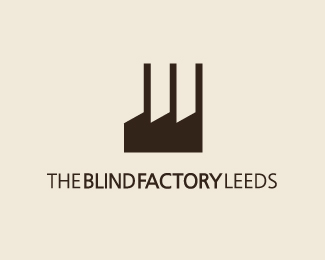
Concept for a blind specialists based in Leeds. Please leave any comments!
As seen on:
springnet
Status:
Nothing set
Viewed:
11124
Share:






Lets Discuss
Who can spot it? :)
ReplyWell I see the bottom part of some Blinds and factories? am I right?
ReplyI see both. Well done.
ReplyInitially I thought The bLind Factory was a workshop for the visually impaired, so I was struggling to see the connection. **Now that I know that blind refers to the vertical kind, I see both and have to commend you on a brilliant concept. **This is perfect in my eyes.
Reply@logomotive - Yep you're right, Mike is it? (Big fan of your work!)*@illusio - thank you!*@koodoz - thanks very much! really appreciate it!**Got to present this to the client and get working on their website next...busy day!*
ReplyClever one.
ReplyI love it! Hope the client does too.
ReplyThanks Danny, this is one of those logos that if your client does NOT pick, go jump off a high building because it's brilliant in the fact that it's so simple and conveys two things in one depending on how one looks at it. %22Oh I get it%22 factor, again great one.
ReplyGreat job and nice concept. Good luck with the client.
ReplyWow, thanks - so many of you who have commented are an inspiration as to why I started to get back into design! so comments like that really mean alot to me!**My first milestone is to get a place on the front gallery within the next month or so - hopefully I can keep improving :)**The concept is with the client so fingers crossed...**
ReplyWell ya got my vote for FP on this one :-)
ReplyI kinda think this one's getting overlooked because it looks like all the %22other%22 factory logos, but it's special.
Replybrilliant :)
ReplyThanks again you guys - it means more to get good comments and i'm really happy to for being mentioned in the same sentance as 'front page'**I'll get that wall spot someday! maybe. hopefully. :D
ReplyGreat!
ReplyOnce again I find myself coming back to the brilliant simplicity of this logo. Top work.
ReplyYeah, this is fantastic danny. Congratulations. Something to be proud of, forever %3B)
ReplyAt first glance I thought another factory for a factory co. name, glad I clicked through to see what it was all about. Very appropriate, nice work Danny.
ReplySOoooooooooooooo good.
ReplyThis Logo is an award winning logo IMO could be in ANY logo book. Danny ya got my vote.
ReplyFantastic concept, brilliantly executed. Floated and fav'd : )
Reply:D thanks for the comments guys! appreciate it. :)
Replylove this. great job danny
ReplyWas it the client's decision to put doors on the final version?
Reply%5E That ruined it IMO.
ReplyHey guys. The version you see here was my final concept. I never touched the version they're using. It was their amendments to my vector I sent. :(
ReplyI agree but I had no say really - I am keeping this one for my portfolio for sure.
ReplyNice work, Danny. love this.
ReplyWow. Just checked the website. It makes me want to cry.
ReplySo clever.
ReplyHey thanks for the gallery slot.*@Climax - yea I didnt get done over so it's cool...but I've also heard of that happening!**I think a site redesign will be next on the list - in house job by a non-web designer.**Danny
ReplyThat's bang on the money... brilliant work Danny.
ReplyThanks Big Al
ReplyShame on me for missing this one too. Very smart solution.
ReplyAmazing Danny!
ReplyThanks Kev, Robbert :)*
Replyterrific concept and design. well done.
ReplyCheers Mike :)
ReplyNice to see this one in Gallery, simply brilliant.
ReplyWow this one is amazing.
ReplyI really like the icon because it portrays both %22Blinds%22 and %22Factory%22 so it's fantastic. But I think the type is poor though. I wouldn't have positioned it as you have because the bold 'Blind Factory' sits off-center to the logo. And the kerning is all over the place. look at the %22LI%22 and %22CT%22 compared to %22ND%22 and %22OR%22. **
Replybrilliant! definitely one of my faves
ReplyPlease login/signup to make a comment, registration is easy