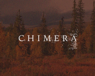
Description:
Approved logo for a new Danish jewellery company. The client was extremely satisfied with the custom type and implied bark texture. These are the key values she wanted communicated through the design:
- Evoke the poise, grace and austerity of Nordic nature.
- Reflect ephemerality, the transience of the seasons.
- Reflect understated quality and naturalness.
The next stage is to finalise the colour system then complete the rest of the identity, which will include stationary, brochures and eventually packaging.
Status:
Client work
Viewed:
4153
Tags:
•
word-mark
•
typography
•
nature
Share:
Lets Discuss
i do like the bark texture there applied horizontally. sort of looks like water reflection too.
Replysomething about this...love that 'C' curl.
ReplyThanks NY and Colin. Appreciate the comments
ReplyPlease login/signup to make a comment, registration is easy