elastique
by designabot • Uploaded: May. 08 '09
Float
(Floaters:
21 )
Description:
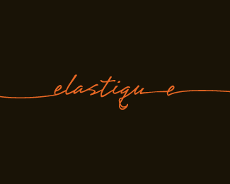
elastique is a Sydney based web design agency. The name said it all to me, so a fun typographic solution utilising one continuous line was the way to go.
Status:
Client work
Viewed:
4,405
Share:



Lets Discuss
Great logotype Rich. I love how you've interpreted the name, but the final 'e' feels too stretched apart.
Replyhey thanks for commenting Chris.*With regards to the 'e'... I just wanted to give it that little extra dimension.*Client loved it but point taken : )
Replylove the type designabot, especially the 'q'. about the 'e', i don't hate it or love it, it's growing on me :)
ReplyAt the end of the day if the client loved it, then job done - that's what pays the rent after all %3B )*You've got some great stuff in your showcase btw.
Replythanks for the compliments guys! They really spur me on : )
ReplyI love the flow on this one Rich, nice job here, also the colour palette works for me, do you have any samples of its use to show?
ReplyTasty script
Replylove this type treatment! but i have to agree about the last e
ReplyPlease login/signup to make a comment, registration is easy