Float
(Floaters:
0 )
Description:
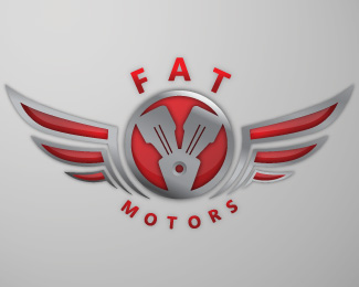
Logo for motorcycle company. Not for sure on the type. Any suggestions?
Status:
Nothing set
Viewed:
1152
Share:


Lets Discuss
how do u put the types with? use path if u want a good arch..
ReplyNice concept, however, I agree with matrixuum's broken english comment about the type. Your curves are definitely off. I also think you should take advantage of the company name more and really play up the word %22FAT%22. At least use a larger, wider (extended) font to help convey the name (and fill in the top space a little more).
ReplyYa I was having so many problems with trying to get it to curve right. but i will for sure work harder on it, and i agree the type should fit the word fat more, thanks for the suggestions...
ReplyPlease login/signup to make a comment, registration is easy