
Float
(Floaters:
0 )
Description:
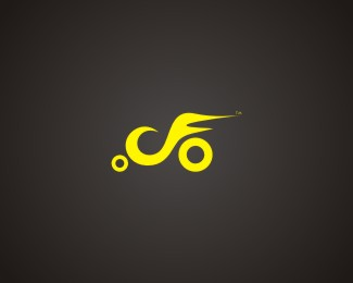
Made to use just C and F which makes it relate to motorcycle company Branding
Status:
Work in progress
Viewed:
717
Share:



Lets Discuss
I like these colors the best, but the type is a little unreadable. Cool idea though!
ReplyPlease login/signup to make a comment, registration is easy