Description:
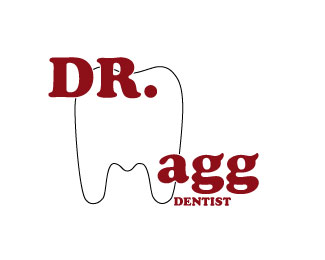
This is a logo we needed to do.
Status:
Student work
Viewed:
1193
Tags:
Logos all around
Share:




Lets Discuss
dicksonecho,
ReplyI like the direction that this logo is going; however I don't think that it is quite there yet. It still needs some work. I am usually not a fan of replacing letters in logos with graphic elements, but in thais case I feel that it could work if we tweaked your illustration and your font. Also in this case I do like the font, but once again this font is very specific in its use; and I don't know how we'll this actually fits the over all look and feel of the logo. It feels very military, and your dentist office it the last place that you want to look and feel militarian. You are on the right track, you just need to spend more time on this and keep refining it.
I believe vision is being very....kind. So, dicksonecho, I'll be a little more straightforward with you and say that this work isn't at a professional level. The line weight is thin, while the typeface is thick. TOO out of balance. If you shrink it down to a smaller level, one that would be used on a business card....something along the lines of 2 inches by 2 inches, you'll see that the line of the tooth disappears.
ReplyBalance it out, and you *possibly* might have something workable here. Right now, it isn't anything you should show a Client.
Please login/signup to make a comment, registration is easy