Float
(Floaters:
51 )
Description:
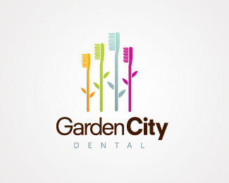
Toothbrush Garden, fairly self explanatory
Status:
Client work
Viewed:
15765
Share:


Lets Discuss
cool concept
Replythe direction on this is fresh...
Replycool......
ReplyGood concept! Ditch the colored 'City' part and that's it!
ReplyVery nice! Agree with Bojan though %5E
ReplyI can always appreciate a dental logo that doesn't have an uprooted tooth in it. Good work.
ReplyI agree with logoholik. Ditch the color on City and this is great.
ReplyNice symbol...
ReplyNice mark. I agree about the colored %22City%22. Gradients are a pain in print. Maybe green?
Replyi think the violet one has more value than it needs. good though.
Replythanks all, suggestions noted and made, and much improved i think you'll agree. There's and alternative logo in my showcase if anyone's keen to give me some constuctive criticsim on that one.
Replyheh, not yet :) ditch the bold 'City' when you already put space between two words :)
Replyfirst one was better. is that black or brown?
Reply%5E what logoholic said.
ReplyVery cool! but definitely drop the bold on the 'city.' I don't think you need it.
ReplyWhat a pity, I will not speak English
ReplySweet. Love the colors. Agree to the bold.
ReplyCool! very very nice!... you can also try different colours %3B%3B)
ReplyMaking a dentist fun is a challenge - I reckon you've done it with this one.
Replygreat concept/colours!
ReplyPlease login/signup to make a comment, registration is easy