



Description:
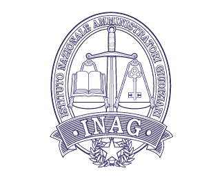
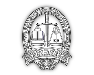
Drawing from classical symbolism , that distinguishes and identifies the universally judicial context , the figure of Justitia , the ancient Roman deity personified in the feminine figure , provides us with a symbolic set highly significant that we decided to integrate in order to better delineate the identity of the new brand .
The logo was inspired by the ancient art of engraving and governed by two basic elements : the paper and ink that is white and black, both equally important , inseparable, as a function of each other.
The black gives the image of the body, the white breath and vital vibration .
The brand aims INAG with a picture of elegant , compact and balanced weights and shapes.
The Sword that dominates the center of the logo becomes at the same time balance , fusing the two are inextricably symbolic elements.
In to the plates, which hang from the hilt guard , I was placed the code and the key , respectively icons of law and property.
An ellipse contains all the elements, confining them in a well defined and ordered around which runs the full payoff .
An elegant ribbon at the base hosts The logo that in turn overlooks the star symbol of Italy and institutionalization of territorial entity.
Status:
Unused proposal
Viewed:
2246
Tags:
code
•
code
•
Italy
•
engraving
Share:





Lets Discuss
Please login/signup to make a comment, registration is easy