Description:
Redesign for Adperium, an online advertising network.
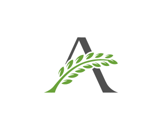
Their old logo is based on the usage of some
laurel leafs, thing that I continued to use, just that in another form.
As seen on:
Status:
Client work
Viewed:
7544
Tags:
laurel
•
green
•
imperial
•
advertising
Share:



Lets Discuss
lovely work Florin:)
ReplyThanks Deividas
Replyyes love it nice. In serbia i saw about 10 same design for AGRO, EUROPA, AGRINA etc. That have same A idea.
Replylook nice :)
ReplyThank guys,
Reply@ Communication Agency, hope nothing too close to this, I imagined other logos having a similar idea could be out there, have to admit that i did not do an extensive research.
From the names you are saying these are mostly agricultural companies. tried to keep away from that area having the branch as clearly as I could
Excellent!
ReplyThanks Levogrin
ReplyWorkhard! :) Great!
Replythanks ricardobarroz,
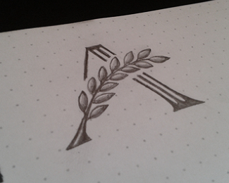
Reply@David, yea that was the initial concept of having a thicker A stem there and the strips almost like forming a roman column there to further convey the "imperium" feel;
that was the concept that went to the client, they decided to simplify the design and then i went on integrating the mark with the type (Sanford at that time) and customized it to better go with the A serifs and weight
Glad to see this one on the front page, great work Florin :)
ReplyThis is great stuff!
ReplyThis is freaking A!
ReplyThis is great man. Straight to my favs. I think I like the simplified look. Works well in all sizes now.
Reply@David, the client was great actually and I perfectly understand and comply to his reasoning for going for a more simplified version. cheers :)
ReplyThanks Stelian, Rudy, Kevin for the nice words
Beautifully done.
ReplyNice Work.
ReplyThanks pjmaster and ksonerkaya
Replygreat one
ReplyPlease login/signup to make a comment, registration is easy