Description:
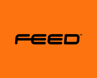
WIP. I'm sure you can guess what they do :)
Status:
Work in progress
Viewed:
6875
Tags:
kitchen
•
utensil
•
fork
•
black
Share:


Lets Discuss
I saw the fork coming out of the F. Cool work mate.
ReplyYeah that FE ligature is smart!
ReplyWord ! !
ReplyI love how simple this design is. The fork coming out of the 'f' is subtle but really makes the logo. Great job!
ReplyThanks fellas
ReplyForking great. Love the subtle ligature, was wondering if an E & D ligature could've hinted a spoon...but that probably would've been too much.
ReplyGreat, deserves much more attention.
ReplyThanks chaps. Working on merch now :)
ReplyI like how the F feeds into the E... nice touch (intended pun)
ReplyI always love the hidden elements in logos.... well done
ReplyForkin hell!
Replysuper
Replygreat logo!
ReplyI like this kinda work. Simple but comes with a message. Great
ReplyCheers :)
ReplyGreat logo!
ReplyDidn't got that it was a fork at first, but that's what makes logos exciting to watch and study! :)
Very good!
ReplyVery clever and well executed.
ReplyThanks all, just got approved :)
ReplyCongrats:)Again,great logotype.
ReplyPlease login/signup to make a comment, registration is easy