
Float
(Floaters:
18 )
Description:
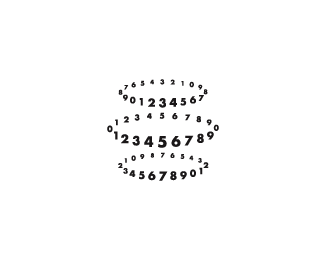
Yet another rejected comp.
Status:
Unused proposal
Viewed:
1664
Share:





Lets Discuss
love this one gareth!
ReplyCheers mate, unfortunately I could not make this client happy. I even offered to strip....
ReplyAsk the client to write some copy for you and reject it a few hundred times. ...kidding. This proves how difficult it can be to design logos for 'real' clients.
ReplyHehe, well at least me and you are on the same page page of copy Roy %3B)
ReplyGoing through the thumbnails, I saw this %26 before clicking on it I said %22That's Gareth's...%22 A successful posting has the ability to turn a rejected comp into a blessing disguise. :)
ReplyLOL @ Roy. So true! Nice job, Gareth. Your client must have one of those, %22I'll know it when I see it%22, kind of attitudes. Like picking a needle from a haystack.
Replylove it.
ReplyI'm actually beginning to believe that most clients can't handle a logo that's %22that good%22. Like I could hear a client saying to themselves, %22ahh, it's too graphic designey.%22 Well I for one Gareth think it's great.
ReplyCheers, keep your eyes peeled the job may land on your desk this week %3B)
ReplyAll your options are just awesome, the client should have a tough time deciding which one to pick
ReplyPlease login/signup to make a comment, registration is easy