Float
(Floaters:
49 )
Description:
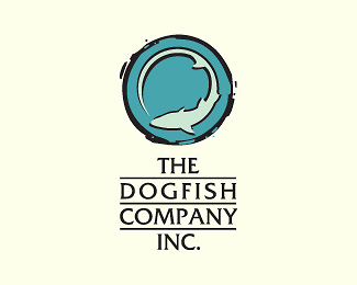
Logo for a restaurant company.
Status:
Nothing set
Viewed:
17473
Share:



Lets Discuss
!0x :) Coming from you, ClimaxDesigns, this means a lot %3B)
ReplyLove your showcase, thats why :)
Replylove it
ReplyHmmm thanx, Lush :))))))))))**Great showcase u're starting there, keep it up %3B))
Replygreat logo!
ReplyNice illustration - apart from the dogfish you could be looking down on a glass of Sauv Blanc.
ReplyThis one really has a nice look and feel. Great job.
Replysuper
ReplyVery nice, somehow missed this one...
Replybeautiful design.
ReplyHaha, cool to see this in the gallery after all this time.
ReplyYep! Congratulations!!
Replylove the mark, though not a fan of the underlining of the text. good job nonetheless.
ReplyI agree with onesummer, the mark is nice, and even the type is great, but the underlining leaves much to be desired.
Replygood stuff! love this style
Replysweat design.
ReplyI knew there had to be a dog in there somewhere. Great use of negative space!
Replydezinart, the main %22dog%22 idea was the fish chasing its tail like dogs do, the negative dog is more of a pun, I wanted to see if ppl see it at all :) **Julian, it is really cool, after being up for so long :P
ReplyWas this client work? Looks great! Flows with time and haven't get old (:
Replywow - this brings back memories of my w1k days :)*i was in this one too.. although i was quite amateur back then... **http://logopond.com/gallery/detail/33957
ReplyAhh, memories....
ReplyPlease login/signup to make a comment, registration is easy