Description:
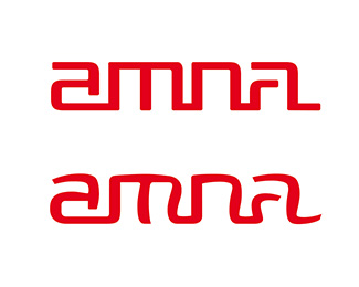
A logo for a singer. I took the square one at the top and turned it into the rounded one at the bottom. Took extra care to smooth the look, keep the rhythm, and have a contrast between straight lines and curves, rounded corners and pointy ones. Went through more rounds of reviews and refining. I know I can keep doing this, but you gotta stop somewhere.
Status:
Work in progress
Viewed:
1225
Share:



Lets Discuss
Please login/signup to make a comment, registration is easy