Float
(Floaters:
1 )
Description:
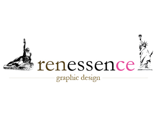
This logo is from a new graphic design company. Is a realy new and modern company.
Status:
Nothing set
Viewed:
1152
Share:


Lets Discuss
I would keep the statue of lib., but I think it is too much width both..*(I would also remove the %22ground%22 from the statue of lib.)
ReplyThere's waaaay too much detail on those statues.%0D*Here's a great example of a much better use of the statue of liberty: http://www.johnlangdon.net/logos/newyorkfashion.gif%0D*%0D*You should really try and simplify the whole thing. Also, the colours are battling each other and there is no system in the alignment. %22graphic design%22 should be centered underneath %22renessence%22, instead it's centered underneath the whole statues/text-combo. Makes the logo look unbalanced and bumpy. A more distinctive type wouldn't hurt either, and watch your kerning.
ReplyI would use only what is similar between the two statures and simplify them a lot (as cybadelic suggests as well). Chest up is my suggestion for both.
Replythx men! very useful tips! **I would try to simplify the statues, mabye both in black?, and I also will center %B4graphic design%B4with renessence text.**any other suggestion?***
Replythanks!
ReplyPlease login/signup to make a comment, registration is easy