Float
(Floaters:
1 )
Description:
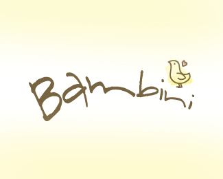
Logo Concept for children's clothing line.
Status:
Nothing set
Viewed:
1379
Share:



Lets Discuss
I love the bird illustration, however I am not liking the curve on the font. It seems a tad distracting.
ReplyI agree with Bart.
Replyi agree with alto.
ReplyI agree with nido.
ReplyI agree with Firebrand.
ReplyI agree with admarcbart.
ReplyI agree with Raja... it's the m that seems most awkward to me.
ReplyI agree with admarcbart, alto, nido, firebrand, admarcbart, raja, and ryantoyota. And I agree with Bambini too...whoever that is.
ReplyI pray no one ever forgets the GREAT BAMBINO, oh wait, wrong website.
ReplySeriously though. I think if you went with a nice slab serif typeface, it will be great. Has that retro 1950's almost feel.
Replythanks for everyones input! maybe your right bart, the thing i like most about it is the bird, not so much the text...
ReplyWell, it's a good font in that it communicates it's for children very well, but it just has a few distracting elements. Like I said, the m is what's distracting me the most. It just seems too drawn out, and happens right at the curve or transition point in the text, so it makes you pause when you read it, causing a break in the flow.
ReplyRyan has avery good point, I think this is the area of the copy that is hanging me up. I still think a nice slab serif typeface would look great.
ReplyWould you please try a slab serif already so Bart will shut up. :-P
Reply@ Oc, Im shutting up.
ReplyI don't agree.
ReplyPlease login/signup to make a comment, registration is easy