Float
(Floaters:
1 )
Description:
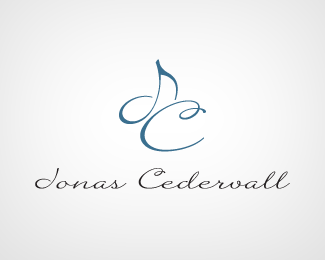
Logo for pianist/organist.
Status:
Client work
Viewed:
1543
Share:


Lets Discuss
I was hoping this had something to do with music. It's an interesting concept. It sort of bugs me, though, that the J looks a lot like a 'd'. Not sure if that's something you can work out. Also, the C seems a little too large in proportion to the J.
ReplyThanks for the feedback man, the client should be pretty open to me playing with the logo a little so I'll see what I can do :). Digging your showcase by the way.
Replyagree with ocular, I too thought it was a 'd' at first, and the proportions. Other than that, its a pretty simple mark, which could be good if that's what the client wanted!
ReplyPlease login/signup to make a comment, registration is easy