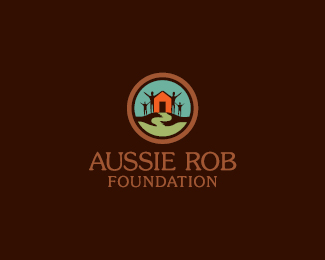
Float
(Floaters:
44 )
Description:
Charity. Empowering people to eliminate poverty.
Status:
Client work
Viewed:
7372
Share:


Lets Discuss
Good job you did here, I like the mark style!
Replyglad you like it Milou. Cheers!
Replyworkd for me.
ReplyNice font choice.
ReplyI really like the colors you used!
ReplyThanks guys! Visually, to me %22foundation%22 looks alright as is. But i'll try kerning it in and see how it turns out. Cheers!
ReplyHere you go David. Kern the %22hell%22 out of it :)
Reply@ClimaxDesigns : Wide kerning gives off a sense of elegance. When done correctly and in the right instances, it can be very effective.
ReplyI love the hands forming the path, adds a certain dimension. Nice
ReplyI see what you're saying, David. You're absolutely right, %22more often than not it is not used 'properly'...%22 In this instance, the tighter kerning does work better.
ReplyIt does work better. Thanks guys!
ReplyNice work, entz.
ReplyThanks Joe.
ReplyGood work, entz :)
ReplyLooks great - nice colors :)
Replyawesome! I love how the often cliche of the people is completely negated by the overall unity of the mark.
ReplyPlease login/signup to make a comment, registration is easy