
Description:
/ 2012
/ Doppos Technologies
The Doppos® Technologies is a company specializing in technology and development of websites and mobile applications. Headquartered in Florianópolis, Santa Catarina, Brazil, the company serves businesses nationwide developing e-commerce, portals, corporate websites, applications for tablets and smartphones and whatever.
Most customers Doppos® are the advertising agencies, digital agencies and design studios that hire the services of development, implementation and support for numerous projects.
The company's mission is to help people and companies to leverage their business ideas to online environment with mastery and market differentiation, through projects with high quality standards and technologies that offer simple solutions and guarantee excellent results.
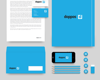
We were hired to create a brand that would launch the company in the market, so it we dived to the root of Doppos® brand, and we seek translating in its visual identity, the simplicity and objectivity that the company carries, transforming the most complex projects in a masterpiece of usability.
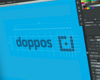
To create the symbol, we seek references in the "magic cube" which is synonymous with "resolution", and in the very letter "d" in Doppos®. The typeface Klavika - designed by Eric Olson - was chosen after extensive testing. Its versatility and the way behaved in writing of the name of the company has given us the certainty that was exactly what we sought.
We hope you enjoy the project. Thank you all!
As seen on:
Doppos Technologies
Status:
Client work
Viewed:
1016
Tags:
Jazz
•
Development
•
Develope
Share:



Lets Discuss
Please login/signup to make a comment, registration is easy