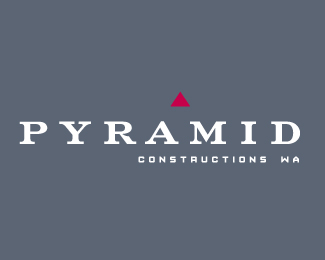
Float
(Floaters:
0 )
Description:
Logo designed for mid-high range building company.
Status:
Nothing set
Viewed:
1379
Share:



Lets Discuss
What if the pyramid were the exact shape of the counter of the %22A%22 and located directly above it like it just lifted out. Would center well too.
ReplyGreat concept, the execution seems to be lacking something small. Not quite sure what though. I like the alignment of the triangle with the %22A%22 and the %22M%22.
ReplyHi euphospug,**I like the subtlety you are going for here. The only thing I would say is that it doesn't seem like you're having enough fun with the type. :) You can break apart letters, or style them in a way that complements the virtual pyramid.**I just took a moment and added some stencil lines... which draw out the shape you are trying to suggest more clearly:**%3Ca href%3D%22http://metaeducation.com/logopond/pyramid_2.png%22%3Epyramid_2.png%3C/a%3E**But I was just playing, also with turning the pyramid yellow and maybe the idea that you could extend the pyramid even further somehow underneath the logotype. But I'm sure there are many more interesting possibilities for this. Nice idea!**Regards,*met%26aelig%3Bducation
Replyhi there guys - thanks for the comments. **meta- I did have about a hundred options that included missing the bar of the A, similar stencil lines etc, but felt they leant to more of an 'incomplete' mark. the company is more high end and refined, so the stencils were inapproproate for this kind of construction company - they're more of a developer rather than a manual-labourer kind of builder. **Nouvae - There are very subtle curves on the bottom of the red triangle that echo inversely the serif curved, but you can't really see that from this JPEG. **Also the client really wanted a minimal mark, that wasn't too flash. Most of the letters were customised too - especially the A and M to fit the triangle shape.
ReplyPlease login/signup to make a comment, registration is easy