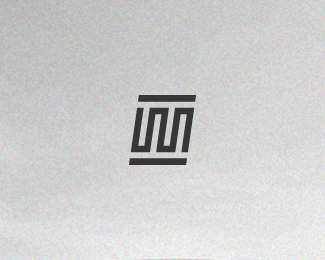
Description:
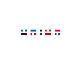
WIP. Personal logo. The lines stand for the diffirent way's to reach a destination. You can take the short / easy way, or you can take the long / best way.
Status:
Nothing set
Viewed:
2576
Share:


Lets Discuss
It would be cool if you could squeeze in the letter F into the line.
ReplyI like your concept and really like the simplicity/elegance of the general shapes. I just think your concept would be even stronger if you keep just one straight line, as if you say: take the longer OR the easiest way, without judging wich one is better, but putting yourself as a designer who can offer both: quick or more detailed solutions, depending on the needs of your client.
ReplyGood job, I\'d like to see the ideas development process! =)
Please login/signup to make a comment, registration is easy