
Description:
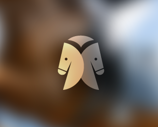
The way this hooved mammal was displayed in the final logo was a great success. The popular mark consists of two shaded brown horse heads facing in opposite directions forming an equestrian jacket.
The unique positioning of the horses allow us to discover the formation of the jacket with ease. A couple of main goals I wanted to achieve, when developing a design for this logo, were to make the final product portray friendliness, dependability, and simplicity.
This logo has been featured in iheartlogos "top 11" most hearted brands of the book.
Status:
Client work
Viewed:
16951
Share:

Lets Discuss
Nice. I see the 2 horse heads and the equestrian jacket right off. :)
ReplyThatnk you Mikey
ReplyThank*...botched that one
Replythis is brilliant, well done
ReplyI'm happy you like it man, thanks for looking buddy
Replythis is very neat and lovely
ReplyAppreciate it Kathariney**Regards
ReplyVery good concept Felipe, very good! :)
ReplyNice. Would be even simpler without the circles.
Reply%5E I agree... free the horses...
ReplyAlen - Thanks for the support bro!**Roy %26 nido- Thank you gentlemen! I'll see how it would look if I remove the circles.
ReplyThanks for the insight again guys.**I only took out the outer thinner circle for this symbol. Designs should be simple but taking out the thicker circle would have taken a lot away from the symbol itself. The circle in this, helps the viewer see the bottom curve that most equestrian jackets have. The composition works better with the circle. **-felro
ReplyI see what you mean. The enclosed white space at the bottom looks like white jodhpurs. Something still looks a little cramped though. Hmmm.
Replyoh alright, I know what you're saying. I also feel a clustered mood in this. I'm going to try something else. Thanks Roy.
Replyhmmm I think you guys were right about eliminating the circle all together
Replynice thinking. good execution.
ReplyWow, now it's sweet!
ReplyWay better!
Replyg8 improvement felro..but the eyes look a lil off to me...IMO
Replyfantastic mark, type is questionable.
Reply%5E Yes.
ReplyMark is amazing...yep the font is a little bit dodgy!
ReplyTo all of you who commented - andreiu, ethereal, Kevin, nitish, Mike, and simplicity thank you guys, much love.**@Mike - Yes, you are right about the type, it didn't work. I think this one works a bit better.
ReplyTo all of you who commented - andreiu, ethereal, Kevin, nitish, Mike, and simplicity thank you guys, much love.**@Mike - Yes, you are right about the type, it didn't work. I think this one works slightly better.
Replydamn...hate when I double comment
Replyme too...
Replyhhmmm... the second bit of my comment didnt register... anyway.. well played felro..
Replyawesome idea.
ReplyLooking real good. My only critique would be that you can drive a truck between the q %26 u in equestrian as well as i %26 n in clothing...and the lack of space between the n %26 g.**The mark itself is brilliant.
ReplyGlad you took the circles off it rocks now
ReplyNever saw the circles - But agree it rocks! Well played (Horses feel like chess knights)
Replywow this really looks great without the circles. Really great mark.
Replywow what a fantastic response.Hayes, cerise, muse, nido and mikey. Thank you all again.**Hayes - Thanks buddy, I fixed it up, didn't catch that at first.
Replygreat effort mate and congrats on the gallery!*
Replymy pleasure...now it's top notch!!
ReplyNice mark!
ReplyLovely!
ReplyMany thanks Rich, Hayes, devey, and gary!
Replymuch better without the circles, great execution!
ReplyGreat icon.... really well executed.
ReplyBeautifully simple! Nice and clean. Great job!
ReplySuper clever! Love it!
ReplyGreat stuff!
Replyalex, lefty, Big Al, bluehaus, michael, and hinton. Thank you guys alot for the floats and support. I appreciate it a lot!**-felro
ReplyReally nice %7E
ReplyThanks impodster!
ReplyHas a client really named their company 'Equestrian Clothing'?
Replythe horse heads idea is very cute by the way
ReplyThanks raja, yes it's adorable. No, my client wanted a symbol for equestrian horse riding clothes but he couldn't think of a name. I put %22equestrian clothing%22 in there to complete the logo.
Replythis has the potential as going down as an all time classic on LP - great work. Have you considered removing the back lining of the jacket?
Replywowowow. brilliant. agree with Raja about its potential. well done!
ReplyThanks a lot, that's real nice to hear
ReplyThis is really good Felipe.
ReplyLove the use of the horse heads in the design of the coat.
ReplyBrilliant! You have a real nice showcase Felro!
ReplyAppreciate it Kathariney
Reply%3C3 thanks peeps
ReplyPlease login/signup to make a comment, registration is easy