Float
(Floaters:
163 )
Description:
Personal project. © roy smith design
Status:
Just for fun
Viewed:
38052
Share:





Lets Discuss
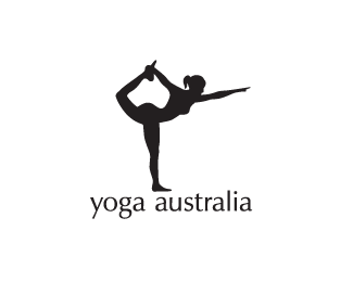
Fantastic! the Australian shape is used quite a bit, with hands etc. However this is subtle, and the hint at the Y is great too.
ReplyStrong!
Replystrewth!!!
ReplyDAMN Roy! Nice!
ReplyAh, very good indeed!
ReplyBrilliant!
ReplyAt first...i was like %22so what?%22 Then I hit land.
Replycleaver, cleaver, cleaver!
ReplyThanks for the kind comments, guys :)
ReplyHoly crap!.Thats hot.
Replyi wasnt being kind!.. strewth!
ReplyJust needs a map of Tassie!!! hehehe!
ReplyGood job.
ReplyGood job. Just needs a map of tassie!!! hehehe!
ReplyLol! Just as well I left it out %3B)
ReplyLike Hobbs, I too was thinking - what the? and then bing - landfall. Very, very good. Brilliant.
ReplyAmazin....Great job!!!
ReplyFarkin' ripper mate! This'd 'ave to be the best adaptation of Australia I've seen in... ever! Bloody mickey mouse!
Replygreat logo
ReplyGreat logo, firebrand!
ReplyThanks people. Even better to get the thumbs up from you guys downunder.
ReplyVERY WOW indeed.*saw it almost right away and then thought, am i seeing it right? yup.**great job!!
Reply!!!Great Logo!!!
Replyhehehe...There is a crude joke about what the shape of tassie looks like, %26 it's almost in the right spot for it :P**Seriously though, awesome image :)
ReplyI was thinking the research for this must of been fun...:)
ReplyThanks fellas.**@brand. Of course %3B) *No, actually a single photographic image inspired me. Connecting the leg to the arm was a real challenge.**
ReplyOMG!!! This is class! In fact, i'll sign-up for a class or two! Great work!
ReplyOn Ya Mate
Replyvery tit
Replywell played indeed. I love the hidden australia. But I do think that the type isn't sitting well with the mark.
ReplyThanks all.**@sisudesigns: Fair point, cheers.
Replyfantastic!
Replyjust great.
ReplyBrilliant! I'm shocked at how much Aussie drawl this logo has bubbled up inside commenters! Yes tassie would have to be a bellybutton.%0D*baha
ReplyThanks for the comments, folks :)
Replydude, this is friggn awesome... Makin' us Aussies proud man!
ReplyCheers. No worries, mate %3B)
ReplyYou can definitelly apply for the other regions (yoga europe, yoga asia, yoga america)... Great logo!
ReplyThanks, Alen. I think she would have to be a contortionist to achieve that %3B)
ReplyDon't you worry my man, yoga people can do that!
ReplyClever!
ReplyThanks, kappa!
ReplyNice job Firebrand, very clever.
ReplyThank you, George!
Replygenius!
ReplyI don't usually give more compliments on the same logo......but.......exceptional this really is
Replydesignabot and cerise, cheers. :)
ReplyThank you Dalius, mate.
Replythis is truly brilliant! fantastic execution.
ReplyCheers, that's very kind, Justin.
ReplyCrikey! great use of negative space.
ReplyThank you, ksustud. :)
ReplyBrilliant!
ReplyAwesome.
ReplyThanks jerron and renalicious.
ReplyI always wondered Roy. How did you come up with this idea?? humm
ReplyThanks demiphonic. Haha Mike, the answer's in your email. %3B)
ReplyThanks thisGuy you must have slipped in under the radar.
ReplyHmmm. Not sure if I see a hint of Australia hidden in there. http://www.australianyogaconference.com
ReplyHmm.. OGA 09 seems a copy to me.
ReplyA poor one at that. It's certainly close.
ReplyI don't have a problem with the pose, it is after all a yoga posture. It's the Australia shape in the middle I'm concerned will be ripped... one of these days.
Replyyou know what, I don't think it's a rip. Firebrand's execution does what it is intended to do, show australia in the neg space. This one is trying to show a %22Y%22. I think it is by coincidence, because if they tried to show australia in the neg space, they did an absolutely horrible job. The pose is what it is, a yoga pose. With that said, i'd take firebrands logo over theirs in a heartbeat. but i would be cautious of them ripping it for future conventions.
ReplyGood points there, George. Cheers.
Replyagree with george wholeheartedly.
Replyhi roy, i came across this logo of yours at %22link text%22 http://www.notcot.org/ and %22link text%22*http://www.graphicdesignblog.org/hidden-logos-in-graphic-designing/**thought i'll let you know :) congrats!
Replyhi roy, i came across this logo of yours at %22http://www.notcot.org/%22and *%22http://www.graphicdesignblog.org/hidden-logos-in-graphic-designing/%22**thought i'll let you know :) congrats!
ReplyThat's a coincidence, someone gave me that link to that blog this morning via:*http://www.designobserver.com/*Cheers, Sandhya!
Replyi'm gonna try this with my girlfriend to see if the australian ma appears :))%0D*one of the greatest!
ReplyWell if she puts her back out don't blame me %3B) Thanks Andreiu.
Replyvery clever idea. excellent execution!
ReplyThanks, birofunk.
Replyseriously Roy! if I could float this 10 times I would
ReplyExcellent!
ReplyI love this. It's perfect. Congrats on the LL5 selection with it too!
Replydesignabot, Petro, 903creative... Thanks.
ReplyOh yes, I remember that. Whatever happened to Grace Jones?
ReplyI saw her last summer (sing), she (still) rocks man!
ReplyWow! You are very clever.
ReplyThanks, RGD.
ReplyRoy, this is TM (Timeless Masterpiece). I know You know it, but i have to say it loud :)
ReplyThanks for that, Jan. I admire your work too.
ReplySo clever...! :)
ReplyVery well done and an awesome concept! As an Australian that's one of the best logo's I've seen!
ReplyThanks, LiverpoolFanAU. Good result tonight. Are you Chanpion in disguise?
Replyher bellybutton could be tasmania...please, don't do that - its a joke! haha
ReplySo when you posting the new stuff mate?...
ReplyWhen am I posting new stuff? Oh yeah let's see what I can find.
ReplyI can't wait!
ReplyTrolls are amongst us.
ReplyPerhaps David will consider letting the mods delete the spammers. Best to have 10 pairs of eyes than one. %3B)
ReplyAmazing work!
ReplyBrilliant!
ReplyThanks webcore and mamgust. alanjohn43 - bugger off.
Replygive a float to this one to enter the 100club it deserves it! anyone?
Reply%5E100, there you go.
ReplyThank you kind sirs!
Reply%5EYeah a lot more people voting these days. Especially for illustrative logos.
ReplyHey dude, love the logo! Great job!**Came across something similar the other day, not sure if you've seen this yet:*http://www.braceshop.com/template3/images/logo.gif
ReplyShame, I wish the same could be said of your blinds.
ReplyAbsolutely fantastic logo ! Geniously done. :)
Replyvery clever.
ReplySTRUTH! you beauty mate. onya!! (*translation: WOW! this is beautiful my friend. Good on you!!)
ReplyCheers fellas!
Reply...:)
Replyit's really beautiful ...
ReplyThank you Sergey :)
ReplyGreat posture, great figure, GREAT MARK!
ReplyI love it! what's the font?
ReplyThanks, it's plain old Optima.
ReplyIt's amazing...
ReplyVery creative!
ReplyI LOVE this!
ReplyThis is really amazing!
ReplyRoy, have you presented this to any Australian yoga companies? An idea this strong needs to be in the public domain :)
ReplyNo Dan, it just sits there on the internets like a sculpture. When I designed it there wasn\'t a company called Yoga Australia.
ReplyNow there is.
@firebrand I have seen a lot of your logos on various sites and blogs. I really like your style man. Keep it up!
Reply@Savik Thanks!
ReplyPlease login/signup to make a comment, registration is easy