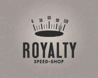
Description:
Speed-o-meter crown.
As seen on:
Fool's Errand
Status:
Just for fun
Viewed:
3007
Share:




Lets Discuss
This is good concept, but letters so big, that I'm fear
Replylove this idea! play with the execution some, and it's a homerun!
Replynice 1
ReplyWhat is it that is lacking in your opinion Nathan? Glad to get some feedback on this.
Reply'Lacking' would be a lil' harsh, as i think this execution works well. Really all I meant was that I'd love to see some other approaches to the same concept. I'd like to see one that has a more 'english' feel to it, if that makes sense, because the first thing i think of when hearing the word 'royal' is kings, queens, etc. The crown definitely addresses this greatly (although i'm not sure about the heavy oval shape for the underside of the crown. i think you could get away with just a stroke in the shape of the top of the oval), however if i were to look at the type by itself, it doesn't say anything about royalty. I'm not saying the type should be as interesting or conceptually driven as the icon, i just think they should both drive each other to the same concept, if that makes sense. The crown says royal for sure. The type right now says 1950s americana. And i don't think there is really anything wrong with that, it's just a slight disconnect for me. I want the whole thing to relate to royalty, and it could be something as simple as putting the type on a curve, or incorporating a tiny little flourish of ornamentation into the type, or maybe it is wrapping the whole thing up in some crazy americana-style royal seal! Haha man sometimes i need to keep my mouth shut before people start thinking i'm a jerk because i really do love this mark as it stands, which is why i commented in the first place!
ReplyDefinitely great points. I'll be trying some of those ideas out tomorrow. Thank you so much for the feedback. Sometimes, I think people can be too nice on here. My best work in school came when my first round of concepts were torn apart...if that makes sense.
ReplyI couldn't agree more. I remember senior year my prof pretty much tore my portfolio apart. Completely changed my outlook. Something i've noticed over the years is that you can really tell the true designers from the rest by the way they react to critiques. A true designer will listen to what you say and try to improve on it. Bad designers turn inside themselves and think you're stupid for suggesting that their work isn't perfect. Or worse, they can tell their work isn't up to par, but are too lazy to fix it.
ReplyI have to agree with Nathan. Conceptually, this one is a slam-dunk for me, but with some type exploration, it really could feel more regal. Think classic Bentley versus classic Ford Mustang.
ReplyStunning concept! How did I miss this one!?
Replywhat a great idea !!!
ReplyPlease login/signup to make a comment, registration is easy