Description:
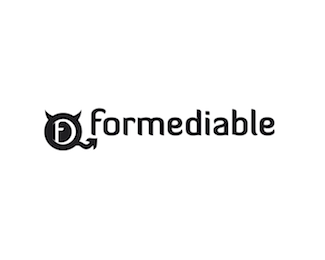
Brand identity development for my online media design/development company... Currently in gestation, feedback is very welcomed!
Status:
Nothing set
Viewed:
734
Share:
Lets Discuss
I think it's hurting my eyes because I see an eyeball looking left, so naturally your own eye wants to head left, but the arrow pointing down makes my eye want to look down. It's causing my eyes to shift instead of flow naturally. I took a screen shot of this and played a bit in photoshop with it, and I think the problem is in that extra arrow shape that comes off the bottom of the logo. If you take it out you'd be surprised on how much more simple the logo feels. Also, do you need the %22tail%22 to be so geometric? I only ask because you have curved horns. I think you might be able to add some curves to the tail, or lose the curves on the horns. Either way, maybe match up their looks. Just a suggestion. Good luck.
ReplyPlease login/signup to make a comment, registration is easy