Float
(Floaters:
1 )
Description:
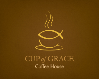
Logo created for a church coffee shop.
Status:
Unused proposal
Viewed:
9102
Share:


Lets Discuss
Clever idea. I think your perspective is just a bit off though. The saucer should be a bit deeper vertically to match the opening that the fish symbol makes. I also think you should tuck the words %22Coffee House%22 under the word %22Grace%22 so that they're flush right. Right now, the descender of the %22f%22 is forcing too much of a hole between the lines of copy.
ReplyBrilliant! Never thought about that. I think you're totally right. I'll give it a try...**Thank you so much for the feedback!*
ReplyPlease login/signup to make a comment, registration is easy