Description:
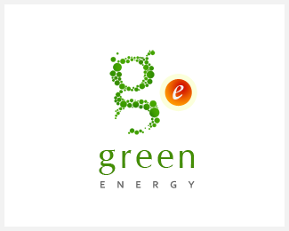
Logo for Green Energy. Another iteration for the company that deals in Solar Powered Accessories.
Status:
Nothing set
Viewed:
1452
Share:



Lets Discuss
reminds me a Shrek logo, but its cool realy, and i like it!
Replynice
ReplyLose the extra ear on the %22g%22 and it won't look so much like Shrek.**Also, how would it look if the text were centered under the %22g%22 only, not the %22ge%22 combination?
ReplyThe 'e' icon looks quite a bit out of place, both color- and style-wise.
ReplyI agree with *epsilon*, I think the %22e%22 is disconnected from the composition!
ReplyAgree the e doesn't fit very well, almost like you have 2 marks? Maybe try the e in the top bowl of the g... might work. The space between the dots in the g might plug (needs air IMO).
ReplyThanks for your feedback. I agree e is not a match with the G but this is the intentional %22off beat%22. It stirs the element of question and I like it because it is involving the viewers.. isnin't it?
ReplyNo, it's not involving the viewers. It is stylistically unrelated to any other part of the logo. Its type, shading, palette, shape - everything's different, so it looks like something that was accidentally pasted into the logo.
ReplyIt confuses the viewer. I'd lose the e.
ReplyOr perhaps extend the g at the bottom to form an %22e%22, possibly with a transition in colour. Although it would make the mark quite vertical. Good luck!
ReplyPlease login/signup to make a comment, registration is easy