Description:
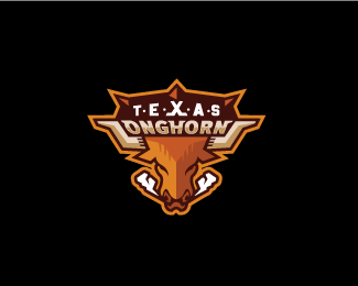
A logo for the University of Texas Hockey program. I'm not sure the team is officially using using this any more, but it was their logo for a number of years. i spotted their goalie with this on his sweater recently, so its still kicking around!
As seen on:
vanpaul.com
Status:
Client work
Viewed:
21040
Share:





Lets Discuss
Nice work Gregory!
ReplyThanks Joe!
ReplyReally caught my eye! Good work Greg
ReplyI don't see why they shouldn't Grigoriou, this is a classic logo.
Replyvery nice sports mark.
ReplyFantastic, Greg. Love the L/S integration with the horns.
Reply%5EGreat! Totally read the L/S in the type right away, but I didn't catch the horns until after my second look... Very cool!! Well done!
Replymike? who the heck is mike? he must be pretty good! jokes aside that is probably one of the best compliments i have ever received here lol
Replylovely integration of the type with those horns, very nice logo
Replyvery slick, Gregory!
ReplyCowaBueno!
ReplyNice illy and color pallet.
ReplyLove it!!
ReplyVery nice work.
Replywow!
Replygood, rly nice logo!
ReplyI love this! Great Idea having the horns make the L and S. It's easy to see, and still legible.
ReplyPretty cool, I can see this as a sports team mark.
Replyexcellent... this is awesome! great job!
Reply%5E I thought the same exact thing about the wide grin at first glance.
Replyhook em' :D really cool man, clever %22L%22 and %22S%22.
Replynice
ReplyBright work)*like this bull
ReplyPlease login/signup to make a comment, registration is easy