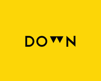
Float
(Floaters:
33 )
Description:
version number 2 of an earlier one i did
Status:
Just for fun
Viewed:
7616
Share:


Lets Discuss
Is there any reason the downward-pointing arrows are aligned with the top of the letters? I think it would read well as a W and support the idea even better if the W was moved just below the baseline. IMO.
Replyagree with chirp....nice execution! love it anyway :)
ReplyI liked
ReplyThis concept feels like a stretcg there isnt much postive space to create the w in the negative space just my thoughts looks nice though
Replyclever
ReplyI read Down straight away, works well... nice logo design
ReplyGreat!
ReplyPlease login/signup to make a comment, registration is easy