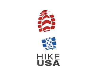
Float
(Floaters:
31 )
Description:
Hike USA is an e-commerce company specializing in hiking and camping supplies.
Status:
Nothing set
Viewed:
6167
Share:




Lets Discuss
Thanks!
ReplyNice twist on the overdone US flag
ReplyI agree. Great concept.
Replynice. caught my eye because it's simple and a nice twist!
ReplyHammjw, interesting work. Perhaps...**1...the %22used%22 feel could be more accentuated %26*2...it would work better with less starts, 3 for example.
ReplyVery cool,great take on it.Maybe the mark could use some more dirt.
ReplyI love it.
ReplyI agree with Respiro's comment about less stars, but overall this is a fantastic concept that was executed very nicely.
ReplyGreat concept, I like it a lot. The top and bottom of the boot print look a little too far apart for me though, especially when the type is so close to it.
Replyi agree with mishdogg, either move the two parts closer to together, or rather, to me, it looks more like some of the shoe itself is 'missing' in between the two parts? maybe fill it back in a little? but great concept. love it.
ReplyBrilliant mark! I like the overall look and feel of this one.
ReplyYeah, I think the red white and blue communicates really well without the stars and chevrons, which feel just a bit forced. Superb concept though.
ReplyOne of the better treatments I've seen in a long time of the often-used boot tread concept. Good job!
ReplyOK maybe the top and bottom are too far and there could be less stars but brilliant concept love it and I dont even like the american flag
ReplyThis works well. Nice job!! Can I make one minor nit picky comment? Did you ever try using the 'U' in USA for the 'A' as well. For some reason, my eye gets stuck on the current A. If you take the U, rotate it 180 degrees and add a crossbar (I think that's the proper term), it would make for a nice 'A' and USA would then fit better underneath 'HIKE'. I hope that makes sense. HAPPY FRIDAY EVERYONE!!
ReplyGreat concept. **3 critiques:*1. Something about the color black doesn't seem to fit with the red and blue. Maybe it's just me.*2. Hike is leaded to close to USA.*3. Hike sits slightly too far left. It isn't visually aligned with USA
ReplyLove this mark. Awsome concept.
ReplyPlease login/signup to make a comment, registration is easy