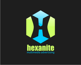
Description:
hello, this is my first logo, not finish yet..
but when it done, i'll use it as logo for my "Future Branding", Hexanite Advertising (i wish it will be come true :D)
i know it so far from "amazing logo", thats why i need your feedback, critiques, and say anything you want
Status:
Unused proposal
Viewed:
871
Share:
Lets Discuss
waiting for comment :hope
ReplyOk here you go. I like the mark. I do think it is way to big and I don't think you need to make color breaks, just one color might work fine. As for the colors you selected, they feel a little strong. Just my opinion. Nice start though. keep at it.
Replyfinally someone care about me, hahaha...*wah, nice information, thanks i'll do better next time.. :D
ReplyYour presentation is much too big. Reduce it by half size, put it square in the middle and it will look much better. Also, ditch the drop shadow. Tricks like that never really add anything unless it's part of the concept in some way. Here it just looks like it's floating off the surface. Who cares about that? **What is the concept of this logo? What is it for? Why are you highlighting the X in the word? You should provide some information about the logo in the description so we have some sort of context in which to evaluate it. Otherwise it will only be judged by its looks.
Replythanks for your comment..**oke, i'll reduce it next time, and about the drop shadow, im just wanna to separate the logo from the background, but its seem doest help much..**oh i forgot about that description, this just a concept logo for my %22future branding%22, i have a plans to build my own advertising workshop, printing and digital ads..**thats why i blend 2 different color on that logo, blue for web, and green for printing (just my suggestion, i'll find a better color)..**a HX in the middle of hexagonal, why i highlighting the X word, cause in my country X means extraordinary, uncommon, etc. Most of Ads in my country so common and boring, and i want to change that, by bring design**i'll do better next time*sorry for my bad English
Reply*)Most of Ads in my country so common and boring, and i want to change that, by bring a better and unique design
ReplyYou can make changes to this logo and then update it.
ReplyWell, thanks for all the advice*tonight, I will make revisions
ReplyPlease login/signup to make a comment, registration is easy