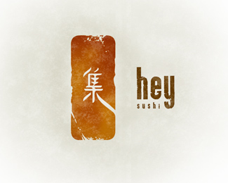
Description:
A modern, inventive sushi bar in Lincoln Park, Chicago.
Shiro Maguro Tempura ... best roll by far.
Status:
Nothing set
Viewed:
49710
Share:


Lets Discuss
by far one of my favorite logos I've seen on here. I can't put my finger on it, but I definitely got a sweetspot for this one.
Replyyeah! i like the grungy, modern style! good job!
Replyawsome humanot...
Replyvery nice indeed ... thrown a bit by the treatement but makes it unique ... very cool
ReplyTop drawer as usual.
ReplyGorgeous image!
ReplyPerfect humanot. Love the mark and the font choice I would want to see what the sign is going to look like for the restaurant are you picking the material?
ReplyVery very cool. I love this one...such style.
Replywow guys ... thanks for the feedback and compliments. this project is still in the works, so the details of everything are still in the air.
ReplyLooks good! Sidenote: Are they on Clark near Diversey? If so, this is a big improvement.
ReplyI wondered when this one was finally going to be on here. I have admired this logo for some time. Nice work!
ReplyThat's a beautiful design!
ReplyIs the final version also with the grunge effect? Is it a good thing to associate the state of being covered with unclean things with food? I guess some can say its weathering but in that case it does not represent a modern place.*In its smaller size on the front page I didnt see the word sushi and it reminded me of a band aid.
ReplyI'm from Van, and to me that definitely does represent a modern sushi place. There aren't many sushi places in Switzerland %3B ) ...or Asian people for that matter.**Great job.
ReplyThe style makes me think of Hapa Izakaya, on Robson and Nicola, I think...awesome restaurant, check it out if you haven't.
ReplyBernard, it is not the symbol but the weathering I was refering to in terms of it communicating the idea of something modern. *There are more sushi places and Asian people in Switzerland than you would think, perhaps it is best to see more of the country and understand it better before making such generalizations. I dont even know why you brought it up as it is completely irrelevant to this logo.
Replyhumanot, this is vety nice, and being a sushi lover myself, I can tell you I don't see anything 'dirty' or a 'band-aid'
ReplyThis is one of the best I've seen on this site. So beautiful I want to weep.
ReplyI think it's very nice for a sushi joint, and I'd really like to see the collateral materials for the brand.**One thing though I'm not fond of is your use of textures and gradients/patterns behind all of your submits -- are they really necessary, or just extras?
ReplyTo me, Sushi is all about the flavor and texture. This logo has both. Very clever in my opinion. :)
Replygreat work indeed!!!*keep it up!
Replywow....just wow....
Reply@ Ocularink: I'm okay with the cut-out texture on the rectangle%3B I was speaking more about the circular texture behind the logo. I don't see it as functional, as it seems fairly superfluous to me. I noticed that HUMANOT does this with almost every logo he has in his showcase. Some of them it works for it, like for the hockey logos. Adding it to every logo though isn't necessary, IMO.
Reply@ theuprock%3B It's just a little watermark to show everyone that this is a Humanot piece, it's no different from writing 'Property of Humanot' on it, except this is more aesthetically pleasing.**I think it adds to the images, as logos look better on paper. To me logo's on an abundance of white screen space have tendency to wash out.
Replyhttp://heysushi.tripod.com/**Are they not using it?
ReplyAbsolutely lovely - very unique and hip, I love it!
Replyincredible %3B)
ReplyThe design is fantastic, but may I ask why you chose this particular character? It looks like a Now Hiring/For Rent sign.
ReplyI think the space between the text and the japanese graphic is a bit too big, but otherwise I agree with everyone. It is a beautiful logo. I think the weathering effect looks more like rice paper or seaweed wrap texture to my way of thinking. Lovely really.
ReplyPerfect! Very Japan but cool and modern. I love that colour. Good job, man.
Replyamazing warmth in this logo%3B immediate favourite. great work.
ReplyVery Innovative....
Replydoesn't really work with the impact of the name ... but it looks great.**
ReplyHumanot is alive and well.
Reply%5Eoh.. cool.. you spoke to him?
ReplyI like it. A lot.
ReplyRealy modern, but very traditional! I like it! Bravo!
ReplyGood to see this in Club 100. Pity it took almost 31 thousand views, but it really deserves the spot. Gratz!
Reply%5EIndeed!
ReplyDamn, I thought I had floated this years ago.
ReplyGOOD Style! %3D)
ReplyDamn, this is too good...........!
Replywonderfull!!!
Replyamazing work ... love it !!
ReplyIt\'s awesome. Good work :)
ReplyI love everything about this logo. Mind blowing!
ReplyPlease login/signup to make a comment, registration is easy