Description:
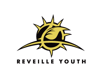
Reveille Youth is church youth group. The church leaders wanted a logo for the group that that was hip and would be appealing to teenagers. I chose to style the logo after the tribal tattoo style. The circle represents the sun cresting over the horizon as well as a crown of thorns. The leaf symbolizes new growth out of suffering and Christ\\\'s resurrection.
As seen on:
iconify.it
Status:
Nothing set
Viewed:
4977
Share:


Lets Discuss
Probably one of the best logos for a youth I've ever seen. Sick job!
ReplyHey leviscot, I like the balance of the logo, and also the typeface is nice.*But to me it seems a bit too agressive, I think mainly because of the thorns. And the color additionally supports that. Maybe soften the thorns a little or another color would make it more open and less agressive.
ReplyReally nice! I think the agressive aspect mentioned above could work for some groups like this. It kind of depends a lot on what the group is like and what the vision of the leaders is.
ReplyPlease login/signup to make a comment, registration is easy