Description:
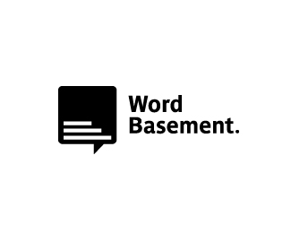
Logo for a copywriting company.
Status:
Work in progress
Viewed:
11076
Tags:
idfabriek
•
logo
•
black
•
copywriting
Share:






Lets Discuss
Very clever, I see the stairs right away! Soon to be in the gallery I\'m sure.
Replyyeah... clever and amusing. Nice work.
ReplyThanks both!
ReplyClever!
ReplyExcellence!
ReplyYes great idea!
ReplyI don\'t know but this is similar to a logo who someone i know did 2 years ago !
Replyhttp://behance.vo.llnwd.net/profiles20/872137/projects/3002797/503ff53262390b55b47fcdab5c036f38.png
i think its different enough
Reply^ me too. I think this one makes you feel like you are already in the basement and can walk up the steps. The example linked above gives another perspective as if you are about to walk down.
ReplyI think the steps in this one also portray a simplistic representation of words within the speech bubble. I like this logo more and more each time i see it!
ReplyHi, what do you think about this >> http://logopond.com/gallery/detail/138471
ReplyI also saw the steps as blocks of text. Really smart and unique solution!
ReplyThanks for all the reactions. :-) My opinion is that the logo is different enough.
ReplyLiking it - very clever and memorable mark.
ReplyClever!
ReplyHa — I love this, and everything I love about it has already been said above, so … bravo!
ReplyPlease login/signup to make a comment, registration is easy