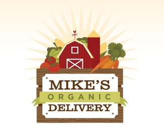
Description:
The client delivers farm-fresh food to local customers, which inspired me to present a crate, which is carrying the farm inside. Since the full logo is very detailed, there are also simplier versions available of just the sign, or the sign with the farm & veggies without the crate for various applications (not pictured).
As seen on:
Mike's Organic Delivery
Status:
Client work
Viewed:
5329
Share:


Lets Discuss
I like the feel of the the illustration but too much going on in there for me. Remember it's a logo and not packaging art (though this could be later for something else). Lose the sunburst behind the un-centered barn. It looks like a generic Illustrator shape. The colors are nice. %22Delivery%22 needs some kerning though.**Can we see what the other simpler versions look like?
ReplyJust wanted to clarify that I DO like the way this is looking and that my comments above were parts I might toy with if I had spare time to kill. I read my post afterward and was afraid it sounded a bit cocky:! ?**Hope not. I am an amateur still learning everyday.*
ReplyCampfire,**No, I agree with your comments, but it does look rather empty without the sunburst. Kearning: good point. Though, this logo is complete now so I probably won't be adjusting it any more. When I get a chance I can submit the simplified versions. Basically, there's one with just the sign/ribbon, and another one that has the sign/ribbon with the barn and only a couple vegetables.
ReplyPlease login/signup to make a comment, registration is easy