Float
(Floaters:
13 )
Description:
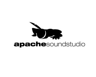
Logo for a small sound studio based in Barcelona
Status:
Nothing set
Viewed:
2388
Share:


Lets Discuss
the concept/idea is very good!...
ReplyYup. Nice idea indeed!
Replythat's cool.
Replymy first thought when looking at the indian was %22ninja with a sword.%22 Any way you can make the feather look more like a feather? Perhaps a splash of color? The smaller that logo gets the harder to distinguish the indian. I love the concept!
Replyfantastic illustration!
ReplyVery nice... Congratulations...
Replyi dont get it.. then i saw in gallery (small thumbnail) i thought of man lying and his ... well you know :D
Reply%5Esame here. Took me a whole minute to see it. It%60s an awesome concept, but not so much execution. At first, i thought that his...sword :) has been replaced with an feather. I think that you really should push this one a little further cuz concepts itself is really really great.
ReplyYep, awesome concept.
Replythis took me way too long to understand.. is me retard?
Replygreat concept and execution.*me ha gustado mucho..
ReplyIm not seeing what this is :S
Replythe idea is great but i also thought it was a lizzard : (
ReplyHmmm....I'm a bit taken aback. I agree that the idea is great but the execution is not strong at all. Took me quite a long time to figure out what the heck it was.
Reply@kreativekeenan. It's an Indian with his ear to ground Listening. I agree execution could improve. I first saw a cricket.
ReplyI think if you pulled out the arms more and made Him more adult like it might help.
ReplyI first saw a ninja crawling. Definitely work on the feather and perhaps a little colour to define the feather.
ReplyMaybe some thin white strokes to define the shapes better? This is such an awesome idea, I can't quite get over it..
ReplyPlease login/signup to make a comment, registration is easy