Float
(Floaters:
1 )
Description:
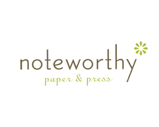
logo for a boutique paperie
Status:
Nothing set
Viewed:
918
Share:





Lets Discuss
I love this simplicity. Asterisk %3D footNOTE %3D nice**I'd maybe shorten the %22y%22 descender and bring the %22h%22 ascender down to the same height as the %22t%22s with the same angle cut.**What if the tagline actually appeared smaller and at the bottom like: *paper %26 press. It would be the footnote reference to the asterisk.**Maybe that wouldn't work everywhere but could be a cool branding element.
ReplyPlease login/signup to make a comment, registration is easy