Description:
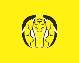
A cobra that shows its might
Status:
Work in progress
Viewed:
662
Tags:
toxin
•
snatch
•
yellow
•
adder
Share:
Lets Discuss
hi i am a beginner, if you wish please explain to me what is wrong with this logo
Reply@irfan98 In my opinion, a little satanic:)
ReplyThere's an issue with line weights and/or where the emphasis should be; the eyes & face details are getting lost because they're the thinnest details, the emphasis should be there. The thick exterior lines that (I'm guessing) create the cobra's neck dwarf everything around them.
ReplyCheck out this piece of clipart; https://encrypted-tbn0.gstatic.com/images?q=tbn:ANd9GcTJfsqBcTaFJQ8DN34wxKqVma9bMDoq28C-HA&usqp=CAU
See how there's a lot of detail, elaborate line-work on the face, eyes, fangs & tongue - but on the rest of the body, shapes are more basic & simplified. More importantly, the overall line-weight (thickness) is fairly consistent overall.
Hope this helps :)
@HayesImage terima kasih sarannya, akan ku revisi sesuai arahanmu, jika tidak keberatan aku akan minta pendapatmu lagi nanti
Reply@HayesImage Thank you for the advice, I will revise it according to your directions, if you don't mind I'll ask for your opinion again later
ReplyPlease login/signup to make a comment, registration is easy