Float
(Floaters:
0 )
Description:
proposal for an executive search company
Status:
Unused proposal
Viewed:
1512
Share:



Lets Discuss
Sorry, but this is not a logo.
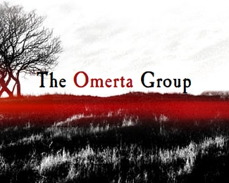
ReplyRegardless of whether it's an actual logo or not (I say %22not%22 as well), I don't understand what an image of a scorched field with a bare tree have to do with an executive search company. The addition of the red color over the scorched field reminds me of a river of blood too. Sorry, but I don't get it.
ReplyStrangley enough, I agree with the comments. I was working with another agency on this one and they were adamant that the scorched field should be used. In the end I just used Caslon and set the company name against the tree.%0D*%0D*Sorry, but it is a logo: the tree and field act as graphical elements - easily recognisable - and the typeface complements the setting.%0D*%0D*However, I don't like it...
Replythis is kind of weird for a logo. gives me the creeps. sorry!
ReplyThe Ominous Group
ReplyIt is kind of ominous. The overall appearance doesn't really convey what they do, even though you stated what the company is. This wouldn't make for a good logo because it's not universal. It looks more like a drama/horror movie poster.
ReplyPlease login/signup to make a comment, registration is easy