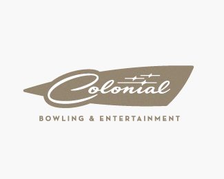
Float
(Floaters:
46 )
Description:
Logo for a luxury bowling and entertainment center.
Status:
Work in progress
Viewed:
12082
Share:
Lets Discuss
nice, devey
ReplyThanks Mike.
ReplyKiller!
Replyooh, nice one!
ReplyI like this. It definitely has a heavy, retro bowling vibe going on. I could totally see that as a placard on the side of the machine that airs off your sweaty palms.
ReplyThanks guys. I had high hopes for this one, but it looks like I have to go back to the drawing board.
Reply:/ Did your client ask for more gradients/lens flares/3-D type?
Reply%5E LOL. Thankfully no. They're just trying to stay away from the retro look and want something more contemporary.
ReplyI Really like the retro feel but can't help to think of a retro Race car. Not sure if that was intentional?*
ReplyLike a Cadillac's fins.
ReplyThanks Mike and JF. I was going for a more elegant take on bowling signage, which I think took me across that fine line into the classic car zone.
ReplyThanks Mike and JF. I was going for a more elegant take on bowling signage, which I think took me across that fine line into the classic car zone.
ReplyYou have very nice attempts on their logo, Jeffrey. Which one was the chosen one?
ReplyThanks guys. I'm working on the second round of concepts now, so I'll post as I make progress.
Replylove your style ... very special !
ReplyThanks! *
ReplyPlease login/signup to make a comment, registration is easy