Description:
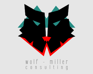
This is a work in progress. You are looking at version 2. Comments are more than welcome! Looking to grow my knowledge and experience of logos. :D
Status:
Work in progress
Viewed:
2148
Share:


Lets Discuss
it's a bit frightning ... on the other hand really interesting ... what kind of consultancy it is ??? what kind of clients/business ... these aspects seem to me very important to understand your concept ... curious to hear more about ...
ReplyThanks for your comment! I love your work. The client is a consultant for mining and international education. It's a tough industry and very competitive. What would you suggest to make it a little less scary?
Replywow ... that's really hard to say ... depends on the mentality of your client ... but in any case you should bear in mind that a logo should explain itself ... I didn't realize that the green M represents mountains until you mentioned it ... so It'll become a hard job for you to explain everybody what the logo's meant to express ... and why blood ?? ... isn't a wolf's nature social, intelligent, and strategic thinking as well as archaic, ferocious, and in a certain way cruel ???? If I where the client I would be very satisfied with a very unique shape of a wolf'%C4s heat/face ... regarding logo work I've learned from the very first day to keep things simple .... but that's only my opinion ... I'm curious about the next step ...
ReplyThank you! Funny you say that. The client initially saw just the black wolf face. The colors/shapes were added after they asked for me to emphasize the subtle W and M shapes in the wolf. They went crazy for it as you see it here. The idea that there are mountains and blood isn't really meant to be obvious to anyone. It was juts where I got the idea for the shapes and colors. If you instead view the green and red as letter-shapes, does that make more sense?
ReplyThank you! Funny you say that. The client initially saw just the black wolf face. The colors/shapes were added after they asked for me to emphasize the subtle W and M shapes in the wolf. They went crazy for it as you see it here. The idea that there are mountains and blood isn't really meant to be obvious to anyone. It was just where I got the idea for the shapes and colors. If you instead view the green and red as letter-shapes, does that make more sense?
Replytry it out ... you know ...there's only one person deciding what's right or wrong ... and that's the client ... a good logo is supposed to do a good job ... however it may look .... I'm curious ... and waiting for new input ....
ReplyThanks tons for your input. It means a lot. This is a work in progress so changes may yet be made. I'll try to update in the future. :)
ReplyPS I'm going to try different eyes. I think that might make a big difference.
Replygood idea ... go for it ... %3BD
Replyimpressive, but scary as it was mentioned above
ReplyThank you! Hmmm. I'm going to have to find a way to de-scary it.
Replyare you working on this nice ID piece ... would be nice to watch it grow ... !! %3BD
ReplyWow thanks for your comment! I'm a big fan. Well, this is the second version. It had a much thinner face before and more 'evil' looking eyes. I want it to be fierce and strong. Do you have any suggestions on improvements?
ReplyPlease login/signup to make a comment, registration is easy