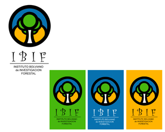
Description:
Bolivian institute of forest investigation
As seen on:
www.petitpetitestudio.com
Status:
Nothing set
Viewed:
3602
Share:



Lets Discuss
The text seems a little thin %26 flowery, especially when compared to the strong, simple curves around it. *As far as the backgrounds go, I like the white and the green the best -- good contrast with the logo. The blue and yellow outside takes away something from the color inside, if that makes sense.
ReplyThanks monastik%0D*%0D*I like your comment%0D*%0D*Best regard
Replynice composition*If you re going to reproduce in small formats u need to adjust the text. a little bit.
ReplyThank you very much Reddskinn, I estimate your commentary, it is something that I must fix. Cordial regards
ReplyNice job creating your logo mark. I agree with the others in regards to the type. This could look better with a bolder typeface to match the mark. I also agree with MonastiK about the colored backgrounds. White and green work the best.
ReplyThanks Ocularink for your comment%0D*
Replyi love the mark... %26 agree with the others about the font...
ReplyThanks Nido, I estimate your commentary
Replyi love the mark... %26 I too agree with the others about the font.
Replythanks firebrand for your comment
ReplyPlease login/signup to make a comment, registration is easy