Description:
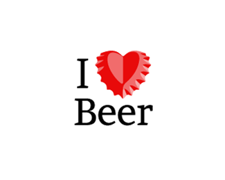
I was playing around with a beer cap last weekend and this came up. What do you guys think?
Status:
Just for fun
Viewed:
27964
Tags:
red
•
heart
•
love
•
cap
Share:


Lets Discuss
I love the lights and shadows on the cap! Really nice.
ReplyLove the concept. Not sure about the type. I think a stronger bolder sans serif would work better here.
ReplyTotally agree about a bolder type, but in my opinion the serifs go well with the cap teeth.
ReplyBravo! You deserve a beer!
ReplyRegarding font - have you considered parodying the classic I 'heart' NY logo? If so you could use a similar font.
ReplyInkwell has a good point. Maybe a slab serif then?
Replygreat cap
Replywow cap
ReplyWell done!
Replyha great idea. You should try to sell this idea to Coke.
ReplyBingo!!!
ReplyI love beer and this logo :P Great idea!
ReplyGreat Concept!
ReplyThis idea reminds me I love logo design, really. It's always a big pleasure to see something smart in this field.
Replywow guys! thanks for all your comments and support! i will try a different font to see how it looks.
ReplySeriously one of my all time favorite... this is so good!!!
ReplyLogomotive is right... or Anheiser Busch
ReplyLOVE IT!
ReplyAgree with Logomotive! sell it to Coke. Its brilliant!
Replysuper smart!
Replycheers for the logo man... good color n concept, typo could be better i think..
ReplyHeineken has already ran with this concept.
Replyhttps://www.signmeup.com/images/clients/84523h_Heineken with a Heart.JPG
1000% logo
Replycooooool :)
ReplyYeah it was a Heineken fundraiser event symbol to support Special Olympics Tennessee. Kinda small use for such a powerful symbol...
ReplyBut this is a better Concept than Heineken
Replyregardless this is a great concept and even greater execution. thumbs up jueves
Reply@t-sovo: It was actually used in a much larger ad campaign: http://files.coloribus.com/files/adsarchive/part_490/4904105/file/heineken-love-me-tender-small-87739.jpg
Replyveeery cool
ReplyGreat job on the cap design, looks awesome!
ReplySo good!
Reply@ Fogra,..Never seen that Heineken add. Great campaign.
ReplyNice find Sean. Cracking ad.
ReplyGuys i�ve never seen that add before.
Replywell you got this place moving again:)
ReplyI also love beer.
ReplyI love Coke.
Replygreat idea
ReplyI'm for a slab serif here =) other than that it's a pretty fun concept!
ReplyMuito bom!
ReplyThe same was used by Heineken on Opener Festival in Poland. Was it yours?
Replythis is cooL!
ReplyThis is so cool, I love this design and I am even using the word love which means it does work.
ReplyShame Heineken hit upon this first. Cause you've done a wonderful job expressing the idea in three colors with killer line work. Great minds and what not…
ReplyOutstanding concept. This is what it's all about folks. So simple and succinct - close to perfection. Heck it IS perfect.
Replydo you have the link of the heineken thing?
ReplyVery cool
ReplyNice!
Replyvery very very coooooool!!!
ReplyDamn Good!....Well done!
ReplyThought i'd floated this already.... ahh well. #100!
ReplyFogra, that Heineken ad is impressive!
Replyhttp://files.coloribus.com/files/adsarchive/part_490/4904105/file/heineken-love-me-tender-small-87739.jpg
Heineken have produced some cracking print ads. I had this idea while sipping a cold one last christmas.... http://www.theloungegroup.com/wp-content/uploads/2011/12/Heineken2.png
ReplyLow and behold, they'd already done it!
Heineken. Probably the best ad makers in the world.
ReplyOh... wait... Carlsberg beat them to it.
quite possibly
ReplyCool!!! I love it!
ReplyLove it! Bending a cap like this is tough too. Lol
ReplyThanks for all your comments guys,
Replyawosome idea
ReplyHehe very clever
ReplyInteresting......
ReplyI love you work!
ReplyPlease login/signup to make a comment, registration is easy