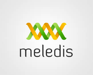
Description:
Logo for a firm dealing with complex IT systems integration. Hint: look for the letter "M" :)
Status:
Work in progress
Viewed:
2193
Share:

Lets Discuss
This is a WIP, struggling a bit on the typo so all comment are welcome. Cheers
ReplyToo much DNA and biotechnology for me (and if it is supposed to be, mark 3D perspective is off, DNA branchs are on the same side of the screw)... For type, I think I should switch to a sans, something more neutral, professional and clean (please forget Diavlo!), something like Myriad or Calibri... My 2 cents.
ReplyI just realized that the ribbons were on the same screw, just tweaked that a little ... The two intersecting ribbons (letters M) symbolize integration, the company's core business.**Still working on the type, will go with something cleaner for sure. **Cheers for the 2c.
Replyreminds me of the css awards
ReplyPlease login/signup to make a comment, registration is easy