Description:
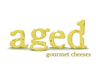
2nd comp for this design, based on suggestions by fellow designers to remove the plate the cheese was on. I welcome your comments and critiques.
As seen on:
www.theartistoflife.com
Status:
Nothing set
Viewed:
2825
Share:


Lets Discuss
this is way better! maybe if you scale just the %22aged%22 some and leave a little breathing space of white around it, you are all set :)
ReplyI did what you suggested and updated the logo here - thanks!
Replyyeah, this version is stronger. I think the 'gourment cheese' could be a bit bigger...if the logo was scaled down, the bottom type might be too hard to read.
ReplyThe g is really problematic with the drop shadow.
ReplyThe g is really problematic with the drop shadow. But it's a nice mark.
ReplyVery nice work! BTW, I took a look at your website. Very nice work! And I was blessed by your openness with your faith! God bless!
ReplyWow - thanks jjjost. I appreciate you taking the time to look at my site! :)
Replywow very cheesy...lol I mean it looks real nice. I like your work:)
Replyhaha - nice, I like this!
ReplyPlease login/signup to make a comment, registration is easy